


CSS interviews are not only about syntax. Interviewers usually want to know how you think about layout, responsiveness, maintainability, and performance in real projects. Many candidates can write styles, but fewer can explain why a specific approach is better under constraints. This article is designed to help you answer CSS questions with confidence using simple language and practical examples. We will cover beginner to advanced topics in a way that is easy to remember and easy to explain in interviews. If you prepare these 20 questions properly, you will be ready for most frontend rounds, including follow-up discussions about real UI issues. Treat this as both revision and coaching, so your answers sound natural instead of memorized.
What is CSS, and why is it important in web development?
CSS stands for Cascading Style Sheets. It controls how HTML elements look and behave visually, including colors, spacing, layout, typography, and responsive behavior across devices. Without CSS, websites are readable but visually plain and hard to use at scale. In interviews, this question tests whether you understand CSS as a system, not just decoration. Good CSS improves user experience, accessibility, consistency, and maintainability. For example, if spacing and typography are handled with reusable classes or design tokens, UI becomes easier to scale across pages. CSS also affects performance because heavy selectors, large animations, or poor layout strategy can make interfaces feel slow. A strong answer should mention that CSS is closely tied to product quality: clean styling decisions reduce bugs, improve collaboration with designers, and support long-term frontend growth.
What does “cascading” mean in CSS?
Cascading means when multiple CSS rules target the same element, the browser decides which rule wins using a clear priority model. That model includes importance (!important), specificity, and source order. This is why two rules can conflict and still produce a predictable result. Many bugs in real projects come from not understanding this process. For example, a button style may not update because a more specific selector is already winning. Interviewers ask this to check whether you can debug style conflicts logically. A practical answer should include that writing low-specificity, component-friendly styles reduces override battles. Instead of forcing styles with !important, it is better to organize CSS architecture and selector strategy well. Once you understand cascade deeply, you can style large applications with far fewer surprises and cleaner code reviews.
What is specificity in CSS, and how is it calculated?
Specificity is the scoring system CSS uses to decide which selector has higher priority when rules conflict. Inline styles are very strong, IDs outrank classes/attributes/pseudo-classes, and those outrank element selectors/pseudo-elements. If specificity is equal, the later rule in source order wins. Interviewers ask this because many styling issues are specificity issues in disguise. A common mistake is stacking overly complex selectors or using IDs in component styling, then struggling to override them later. A better approach is consistent class-based styling with predictable specificity levels. This keeps styles reusable and avoids “CSS wars.” In practical projects, especially with large teams, controlling specificity is essential for maintainability. If your answer includes both calculation logic and strategy (keep selectors simple, avoid unnecessary nesting), it shows you are ready for real-world frontend environments.
What is the difference between id and class selectors in CSS?
id selectors target a unique element on a page, while class selectors can be reused across many elements. In CSS architecture, classes are usually preferred because they are reusable, composable, and easier to maintain. IDs have higher specificity, so once you style heavily with IDs, overriding becomes harder and often leads to messy code. Interviewers ask this to check coding discipline. You can mention that IDs are still useful for anchor links, accessibility associations, or JS hooks, but not ideal for general styling in scalable systems. Component-based projects benefit from class-driven naming patterns because they keep styling predictable. A practical tip is to separate styling intent from behavior intent: use classes for style patterns, and where needed, use data attributes for testing. This helps avoid fragile CSS and keeps codebase cleaner over time.
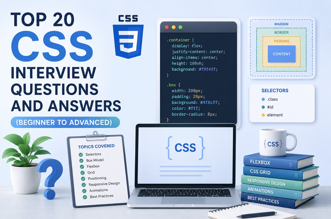
Explain the CSS box model.
The box model defines how the browser calculates element size and space. Every element has content, padding, border, and margin. By default (box-sizing: content-box), width/height apply only to content, so padding and border add extra outside size. With box-sizing: border-box, width/height include padding and border, which makes layout calculations easier and more predictable. Interviewers ask this because layout bugs often come from box-model misunderstandings. A common example is a 300px card suddenly overflowing because padding increased actual size. Most modern codebases set box-sizing: border-box globally to reduce this issue. Understanding margin collapsing and how vertical margins interact is also useful in advanced discussions. A strong answer should connect theory to debugging reality: when spacing looks wrong, inspect computed box values in dev tools before changing random CSS.
What is the difference between margin and padding?
padding is space inside an element, between content and border. margin is space outside an element, separating it from neighboring elements. This difference matters for background and clickable area behavior. Background color extends into padding but not margin. So if you want a bigger clickable button area, padding is usually the right tool, not margin. Interviewers often ask this to test whether your spacing decisions are intentional. A common mistake is using margin for internal spacing, which can create inconsistent UI and fragile alignment. In reusable components, internal spacing should mostly come from padding, while external layout spacing is handled by margin or layout gap systems. If you explain it in terms of component design and user interaction, not just definitions, your answer feels practical and production-aware.
What is box-sizing: border-box, and why is it commonly used?
box-sizing: border-box changes sizing behavior so declared width/height include content + padding + border. This makes layout math far simpler, especially for grids and responsive components. Without it, adding padding can unintentionally increase rendered width and break alignment. Many teams apply this globally because it reduces surprise and makes dimensions easier to reason about. Interviewers like this question because it checks practical CSS setup knowledge. A good answer includes that border-box does not include margin; margins still sit outside element size. In large UI systems, predictable sizing is critical when multiple developers contribute components. Using border-box helps maintain consistency and speeds debugging. It is a small decision with big impact on stability, particularly when building card layouts, forms, and dashboard-style interfaces.
How does position work in CSS?
The position property controls how an element is placed: static (default), relative, absolute, fixed, and sticky. relative keeps element in flow but allows offset adjustments. absolute removes element from normal flow and positions it relative to the nearest positioned ancestor. fixed pins element to viewport, often used for persistent headers or floating actions. sticky behaves like relative until scroll threshold, then sticks like fixed inside its container. Interviewers ask this because many UI bugs involve incorrect positioning context. A common mistake is using absolute without setting parent position: relative, causing unexpected placement. A strong answer should mention stacking context and overlap management with z-index. In real projects, choosing the right position mode avoids hacks and keeps responsive behavior more stable across devices.
What is Flexbox, and when should you use it?
Flexbox is a one-dimensional layout system designed to align and distribute space along a row or column. It is excellent for navbars, button groups, cards in a row, and centering content. Key properties include display: flex, justify-content, align-items, flex-direction, and gap. Interviewers ask this because modern UI work uses Flexbox heavily. A practical benefit is handling dynamic content gracefully without complex float hacks. Common mistakes include confusing main axis vs cross axis, or using manual margins instead of gap. Flexbox is best for component-level layout where you control one direction at a time. For two-dimensional page layouts, CSS Grid is often better. A strong interview answer shows you know both capability and limits: Flexbox is powerful and simple, but not the ideal tool for every structure.
What is CSS Grid, and how is it different from Flexbox?
CSS Grid is a two-dimensional layout system that controls rows and columns together. It is ideal for full-page structures, dashboards, galleries, and complex alignment needs. Flexbox handles one axis at a time, while Grid handles both axes with explicit tracks. In interviews, a strong explanation is: use Flexbox for component alignment, use Grid for structural layout. Grid offers named areas, fractional units (fr), and precise placement controls that reduce nesting complexity. A common mistake is forcing Flexbox into layouts where both row and column control are required. Another is over-engineering simple rows with Grid where Flexbox would be cleaner. Good frontend developers choose based on problem shape. Mentioning this decision mindset shows practical experience and helps interviewers trust your layout architecture choices.
How do media queries help in responsive design?
Media queries apply styles based on conditions like viewport width, orientation, or user preferences. The most common use is adapting layout for mobile, tablet, and desktop. For example, a three-column grid can become one column on small screens. Interviewers ask this to check whether you can build real responsive interfaces, not just desktop-only screens. A good practice is mobile-first styling: write base styles for small screens, then enhance for larger breakpoints using min-width. This usually produces cleaner CSS and fewer overrides. A common mistake is adding too many breakpoint-specific fixes without a system, which becomes hard to maintain. Also consider modern responsive tools like fluid typography, flex/grid behavior, and container-aware design patterns. Strong answers connect media queries to usability and maintainability, not only syntax.
What is the difference between relative and absolute CSS units?
Absolute units like px stay fixed, while relative units such as %, em, rem, vw, and vh scale based on context. rem is tied to root font size, which helps consistent typography scaling. em is relative to parent or current element context, useful but sometimes tricky in nested structures. % often depends on parent dimensions. Interviewers ask this because unit choice impacts responsiveness and accessibility. A practical approach is using rem for text and spacing systems, % or flex/grid for width behavior, and viewport units carefully for full-screen effects. A common mistake is using only pixels everywhere, which limits adaptability across devices and zoom settings. Good CSS is not just visually correct at one size; it should stay usable across screen sizes and user preferences.
What is the difference between display: none and visibility: hidden?
display: none removes the element from layout flow completely, so it takes no space. visibility: hidden keeps the element’s space reserved but hides it visually. This difference matters for layout behavior and transitions. If you hide a menu with display: none, nearby elements shift because space is removed. With visibility: hidden, layout remains stable. Interviewers ask this to test practical control over UI states. A common mistake is using these properties for accessibility without considering screen reader behavior. For interactive UI state management, combining visibility control with ARIA attributes is often better. Also, for animations, you may combine opacity and pointer-events depending on needs. A strong answer should show awareness of both layout mechanics and user interaction impact.
What are pseudo-classes and pseudo-elements?
Pseudo-classes target element states, such as :hover, :focus, :active, :checked, or :nth-child(). Pseudo-elements style virtual parts of elements, such as ::before, ::after, ::first-line, and ::placeholder. Interviewers ask this because these tools help create richer UI without extra HTML. For example, you can add decorative icons using ::before instead of additional markup. A common mistake is using hover-only interactions without focus styles, which hurts keyboard accessibility. Another mistake is overloading pseudo-elements for critical content; generated content may not be ideal for essential information. Strong answers include practical balance: use pseudo-classes for interaction states and pseudo-elements for visual enhancements, while keeping semantic HTML clean. This reflects thoughtful, accessible component styling skills.
What is z-index, and why does it sometimes “not work”?
z-index controls stacking order of overlapping positioned elements, but it works only within stacking contexts. If two elements are in different stacking contexts, a higher z-index in one context may still appear below another. Properties like position with z-index, opacity less than 1, transforms, and certain filters can create new stacking contexts. Interviewers ask this because layering issues are common and frustrating in real projects. A common mistake is increasing z-index numbers endlessly without inspecting context boundaries. Better approach: inspect DOM layers in dev tools, identify stacking context roots, and simplify structure where possible. A strong answer includes this debugging logic. Understanding stacking context makes modals, dropdowns, tooltips, and sticky headers far easier to manage in complex UIs.
What are CSS transitions and animations, and when should each be used?
Transitions animate changes between two states, usually triggered by class changes or pseudo-class states. They are simple and great for hover effects, toggles, and subtle UI feedback. Animations (@keyframes) handle multi-step movement and looping behavior, useful for loaders or more custom effects. Interviewers ask this to evaluate UI polish and performance awareness. A practical rule is: prefer transitions for simple state changes, use keyframe animations when you need timeline control. Common mistakes include animating expensive properties like width/left repeatedly, which can hurt performance. Prefer animating transform and opacity where possible. Also consider user settings like reduced motion preferences for accessibility. Strong answers show both visual intent and responsible implementation choices.
How do you write maintainable CSS in large projects?
Maintainable CSS starts with consistency in naming, structure, and reuse. Use clear class naming patterns (for example, BEM-style or design-system conventions), avoid deep selector nesting, and keep specificity low. Organize styles by component or feature rather than one giant file. Reuse design tokens for colors, spacing, and typography so updates stay centralized. Interviewers ask this because scaling CSS is harder than writing quick page-level styles. A common mistake is mixing global overrides and component styles randomly, which creates regression risk. Another is relying heavily on !important, which signals architecture issues. A strong answer should include collaboration angle: maintainable CSS helps teams onboard faster and reduces styling bugs during feature additions. In short, clean CSS architecture is as important as clean JavaScript architecture.
What are CSS variables (custom properties), and why are they useful?
CSS variables are reusable values defined with –name and accessed using var(–name). They can be scoped globally (like in :root) or locally per component. This makes them powerful for themes, spacing systems, and dynamic styling. For example, dark mode can switch a few variables instead of rewriting entire style blocks. Interviewers ask this because custom properties improve maintainability and design consistency. A common mistake is replacing every value blindly with variables, which can make simple styles harder to read. Use variables for repeated or meaningful design tokens. They also work well with JavaScript when runtime updates are needed, such as user-selected theme colors. A strong answer combines practicality and architecture: variables reduce duplication, support scaling, and make style systems easier to evolve.
How do you improve CSS performance?
CSS performance is usually about smart architecture, not micro-optimizing every selector. Keep selectors readable and avoid overly deep chains. Minimize unnecessary reflows by avoiding frequent layout-triggering style changes in JavaScript. Prefer transform/opacity for smoother animations. Remove unused CSS to reduce bundle size, especially in large apps. Use critical CSS strategy where needed so above-the-fold content paints faster. Interviewers ask this to check whether you understand frontend performance beyond JavaScript. A common mistake is focusing only on selector speed myths while ignoring real bottlenecks like large style bundles and heavy animation patterns. Good performance thinking means balancing maintainability and rendering efficiency. In production, profiling with browser dev tools gives better insights than guessing. Explain this methodical approach and your answer will sound mature and practical.
What are common CSS interview mistakes, and how can you avoid them?
A frequent mistake is giving definition-only answers without real use cases. Another is treating Flexbox and Grid as competing tools instead of complementary tools. Many candidates also forget accessibility topics like focus states, contrast, and reduced motion handling. Some rely on !important too quickly, which suggests weak cascade strategy. To avoid these mistakes, answer with a practical format: concept, where to use it, common bug, and better approach. Interviewers appreciate that structure because it mirrors real engineering thinking. Also, when unsure, explain trade-offs clearly instead of guessing absolute rules. For example, “Grid is better for two-dimensional layouts, but Flexbox is simpler for one-direction alignment.” That balanced explanation builds trust. Strong CSS interviews are won by clarity, practical mindset, and maintainability thinking.
Conclusion
CSS interviews become easier when you stop treating CSS as “just styling” and start treating it as system design for user interfaces. If you can explain layout choices, cascade control, responsive behavior, and maintainability with confidence, you will stand out quickly. You should keep practicing by inspecting real pages and asking why a style decision was made. That habit improves both your interview answers and your day-to-day frontend quality. Ultimately, focus on understanding, not memorization, and your confidence will naturally improve for any interview either Front end, Back end, Testing or IT etc.
Discover more from Newskart
Subscribe to get the latest posts sent to your email.
[…] will improve both interview confidence and real-world frontend output, you can also review the CSS QnA and JavaScript […]
[…] JavaScript interviews become easier when you focus on clear reasoning instead of memorized lines. If you can explain these 20 topics with simple language, practical examples, and awareness of common mistakes, you will already be ahead of many candidates. Practice speaking answers aloud, write small code samples, and revisit weak areas until they feel natural. Confidence grows when understanding is real. Keep your explanations structured: concept, use case, mistake, and better approach. That format works beautifully in interviews, you can also refer CSS QnA. […]